✦ REIMAGINING SPOTIFY
What happens when discovery becomes the reason people stop discovering.
A three-day exploration of why Spotify's home screen, the surface that's supposed to make listening easy, is the part most users seem to actively avoid. The redesign isn't the answer to that question. The case study is.
role
UX Researcher & UI Designer
duration
3 Days
industry
Saas
tools
Figma, FigJam, AI-assisted workflows

When discovery becomes a decision
We don't open Spotify to decide. We open it to feel. But somewhere between the home screen and pressing play, the experience turns into a task. Recommendations stack on recommendations. Before a single song plays, the user has already made half a dozen micro-decisions.
Scan. Compare. Choose. Doubt. Start over.
Discovery was supposed to be the easy part. Right now, it's the work.
This project didn't start with a brief. It started with my sister, who opens Spotify almost every day and goes straight to Liked Songs. "I can't deal with picking. It's too much."
That's not a complaint about music. It's a complaint about the interface. The discovery engine, the part Spotify optimizes hardest for, was pushing her back to a screen she could have opened directly. And she's not alone, the 2023 redesign drew public backlash for exactly this: cluttered, pushing video and podcasts at the expense of music.
The question for this project became: what is the home screen actually for, if the user just wants to listen?
Grounding every decision in usability
Spotify prioritizes discovery, but the experience demands interpretation instead of enabling flow. Users are shown multiple layers of recommendations, categories, and content types at once. Instead of engaging with music, they pause to decide, decode, and navigate.
Three patterns kept surfacing as I worked through the screens:
Overwhelming choice without clear hierarchy
Weak distinction between content types (music vs. podcasts vs. video)
Discovery framed as browsing rather than listening
WHERE FRICTION HAPPENS:
I analyzed three core screens, not for aesthetic problems, but for behavioral ones. Where does the experience slow the user down? Where does it ask for effort it shouldn't need? Where does it quietly work against itself?
The answers were consistent across all three.

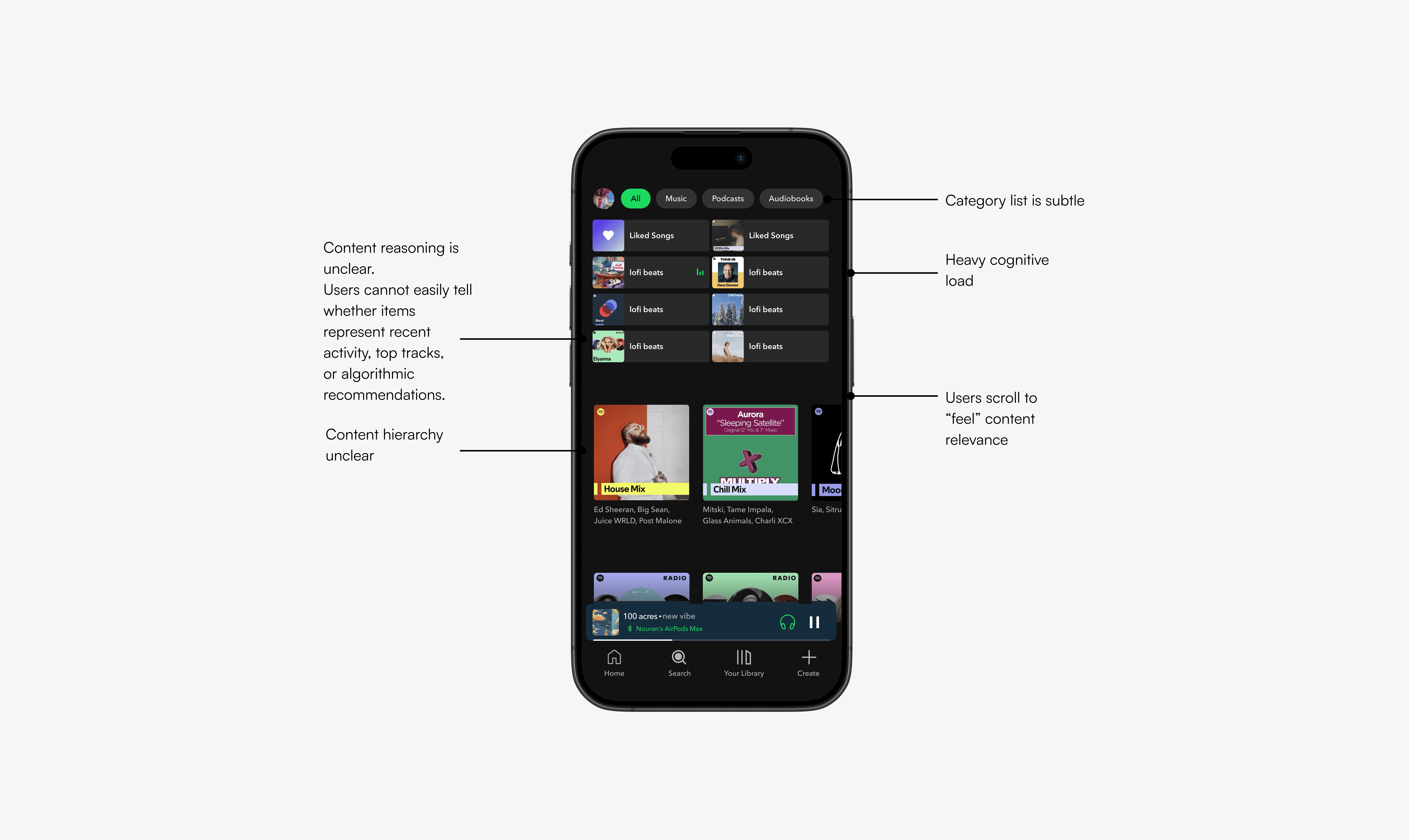
Homepage — volume without direction
The home screen surfaces an enormous amount of content. But more content isn't more clarity. Without a clear hierarchy, every section competes equally for attention, which means nothing wins.
Users aren't being helped to choose. They're being asked to curate their own experience from scratch, every time they open the app. For some people that feels like richness. For my sister, and for a lot of users like her, it feels like being handed a menu when she just wanted water.
The result is evaluation instead of engagement. Hesitation instead of play.
Search — three jobs, one screen
The search screen is doing too much at once. It's the entry point for active searching (I know what I want), passive browsing (show me something), and genre-based discovery (I'm in a mood), three fundamentally different behaviors sharing the same surface.
Users have to decide how they want to search before they can search. That's a step the interface should remove, not require.

Now Playing — the core experience, diluted
This screen should do one thing: make the music feel central. Instead, the hierarchy spreads attention across primary actions, secondary controls, and ambient content, with little to tell them apart.
The moment the song starts should be the moment the interface steps back. Right now, it doesn't.

Clarity as a competitive advantage
Looking at competing platforms, most prioritize engagement metrics over experiential clarity. Apple Music and YouTube Music aren't dramatically less cluttered, they're just cluttered differently. The opportunity isn't to out-clutter them. It's to step out of the arms race entirely.
Not less content. Better organized content.
Reduced visual noise. Emotional resonance. Discovery that feels guided, not dumped. The goal isn't a quieter Spotify. It's a more intentional one.

A visual language built for focus
The visual system is designed with one purpose: help users understand fast and feel immediately.
Color is used with restraint, to guide attention, not decorate. Typography is hierarchical by default. Components carry only the weight they need. Every visual decision is held to the same question: does this make the experience clearer, or does it add noise?
The shift is from visual stimulation to visual confidence.

Homepage — play starts here
The redesigned home screen has one job: get users to music as quickly as possible. Content is organized into defined, scannable sections. The hierarchy is explicit. The entry point into listening is immediate.
Users no longer have to find their way in. The interface shows them.

Discover — exploration with direction
Discovery is restructured around intent rather than volume. Content types are clearly separated. Navigation between modes is frictionless. The experience guides without constraining, a sense of direction without removing the pleasure of finding something unexpected.
Exploration feels like exploration again. Not like search.

Now Playing — finally, just the music
The Now Playing screen is rebuilt around a single priority: the song. Primary actions are visually dominant. Secondary controls are present but quiet. The artwork and the music have room to land.
The interface does its job, then gets out of the way.

From complexity to clarity
Across every flow, the direction is the same. Fewer competing elements. Stronger hierarchy. Less to interpret, more to feel.
The system shifts from algorithm-driven to experience-driven. From a platform that knows what you've listened to, to one that understands what you came for.

What this project taught me
This was three days. It's a concept, not a shipped product. I want to be honest about what that means: I didn't run formal usability testing, I didn't have access to Spotify's data, and any real version of this work would need both.
What it gave me was a way of thinking I'd use on any product. The hardest part wasn't designing the screens. It was resisting the urge to design more of them. Every instinct toward adding a feature had to be tested against a harder question: does this serve the person who just wants to press play? Does this serve my sister, who's already decided not to deal with the home screen?
If this moved forward, the next steps would be usability testing to pressure-test the hierarchy, measuring the downstream impact on listening time, and exploring how personalization could become transparent rather than invisible. Spotify already knows what my sister wants. The question is whether the interface is willing to act like it.
